When I look around at branding, I shake my head at how easy it seems for some people to choose a color. It’s one of the aspects of design that I find the most challenging.
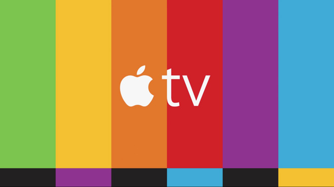
The recent branding for the Apple TV for instance had me smiling …

When I look at it I think how wonderful a design it is, and how important color is within it. Little choices impress me, like drawing the apple logo on an orange background … where orange is a color associated with trust. The widths of the color bars, the combination of colors, how well they work together, how modern they are, how fresh it makes a test card look, yet still distinctively Apple.
I don’t think I could ever find such a nice combination of colors.
The color scheme for ‘Summer Tomato’ ( along with the simple, yet beautiful iconography there ) is another combination that I marvel at:

I really like ‘IBM Design’s color ideas’ too. I’ve been exploring those for some internal apps.
Recently, for my own apps and ideas I’ve been taking inspiration from Pantone. Twice a year they give people like me a gift, a ‘fashion conscious combination of colors’ for Spring and Fall:

These colors work flawlessly together, offering lots of current, tasteful combinations. I look forward to seeing what the experts there propose to us each year.
I used this in a pretty disciplined way when working on my ‘David Bowie app’. I’d sketch the Bowie personas from photos and videos of each era, and then match the colors of his outfits to the Colors of Spring scheme. I was amazed at how well the colors worked.
Color is subjective, we all have our unique tastes. That’s another thing that fascinates me about the future of personalized apps … we’ve been able to choose our own color schemes for many apps until now … I wonder if the apps will figure it out for us in the future - I wonder if colors schemes will be as important as they are now if apps look unique to each of us, based on our tastes, based on our eyesight.
I wonder how others choose colors for their apps.